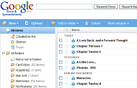
Frankly, I like it a lot better than the old layout. I like the folders, and the "Outlook" style that it is using here. It's more user friendly, and more intuitive to use-after all it is the paradigm that is used by Windows File Explorer, Outlook, and Google's own GMail and Reader applications.
I for one will not miss the pull down menus that were up there, and am glad they've made these changes. Thanks, Google.