Explorer has--at Microsoft's own words--been the foundation of the user experience of the Windows desktop. And likewise, they've gone to considerable lengths to provide the first substantial change to Explorer in years. There's a few... not necessary issues or concerns... but something like that which I, as a technologist, and specifically as a MICROSOFT/WINDOWS based technologist, have about not just the new UI, but what this new UI means in terms of the data provided by Microsoft at the linked to post above.
But first, as a Windows 7 user, there is at least one aspect of these UI changes with which I whole-heartedly agree, and that is the return of the UP button. I did not realize just how often I used that simple little command option while performing file-management tasks until it had disappeared. I think that was my biggest stumbling block when switching my OS over to Windows 7.
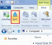
Now, the ribbon menu system itself, I'm less concerned over than most of the other IT blogs out there. I like the ribbon menu, and think it's a great mixture of a traditional menu and command bar that is ultimately more useful for end-users.
But I don't think that's going to be the case here. By Microsoft's own metrics over half of the entry points for Explorer-based commands is the CONTEXT menu (54.5%) with hot keys coming in as second (32.2%). That leaves less than 15% for the command bar and menu bar (and the command bar got 10.9%). What this tells me is that users already aren't using the command bar or the menu.
Oddly, Microsoft's reaction to this, is to make it--at least at first glance--more complicated.
 |
| Microsoft's Simplifies Explorer |
- Paste (~20%)
- Properties (~11%)
- Copy (~11%)
- Delete (~10%)
- Rename (~8%)
- Refresh (~7%)
- Cut (~7%)
- NewMenu (~4%)
- CommandBar (~4%)
- New (~2%)
And the thing is, that this is aimed at the STANDARD USER. This is not aimed at power users, or network admins. In fact, the original blog post describing these changes goes out of the way to indicate as much, by pointing out that the roughly 200 commands found in the ribbon menu will now all support keyboard shortcuts.
Ultimately though, I understand the uproar, while not understanding it. I know from using Office that the Ribbon menu, once users "get" it, is better and more efficient. Additionally, these changes to the ribbon are not aimed at those users who are currently in an uproar. After all, it's going to be the power-users who read up on changes to Windows Explorer months before the associated OS is actually released.
The thing is, is that this is a big change. Worse, it's a change which feels like feature creep and/or command bloat. I mean, look at the menu, it's taking up more room, hundreds of commands are now exposed, and it's all shoved into a new interface. This, when MS admits that ~82% of all commands used are the 10 listed above.
Ultimately, I think a lot of the backwash is due to the smooth UI which was the first taste of Windows 8 in the video released a few months ago. Power users and early adopters saw that new desktop experience, and started drooling, ignoring the fact that the desktop has little to nothing to do with the underlying file system or the explorer used to access it.
Could MS have made this "sexier" or "sleeker." Sure. They could have taken Apple's OSX approach, and given dedicated applications to specific types of tasks.
But, I, as a developer, would be pissed at that. I use the file explorer extensively. I have to move artifacts back and forth between servers and even development-sandboxes on my own machine. I rename things. I delete things, I toss them from one folder to another to my desktop.
But that's at work (or while I'm working). At home (or while I'm playing), I rarely, if ever, explore the actual depths of explorer; I'll access a few folders where I have media stored, and access a few applications, most of which are stashed in a DOCK application, and on very rare occasions, I'll move media either to my NAS or burn it to disc (or bring it back over to my machine for consumption).
Truthfully, I think this is something of a non-issue. IMO, it's only causing a row right now because of how it compares to the iPad and other tablet devices when Windows 8's first preview in the wild was based around a tablet interface (and more specifically, the promise which that preview held for tablet interfaces).
Sure, it may mean a bit more training time for new users (some of whom may still be coming from Windows XP). Sure, it may be a bit more confusing those first few weeks after adoption. Sure, it may not be as sleek and stylish as the Mango interface.
But, as long as it does what I need, and stays out of my way while it does it, then I can live with all of it.